
 AI SMM team
A new visitor lands on your profile, glances at a row of random selfies in the highlight circles and leaves without finding your prices. Instagram highlight covers fix that: a consistent set of circles with clear names turns the space under your bio into a small menu of “prices, reviews, how to book, delivery”. This guide covers the sizes that do not get cropped, five design styles, which highlights different businesses need, and how to set the covers step by step.
Covers are not decoration for its own sake. The point is to make the next step obvious for someone who has known you for ten seconds.
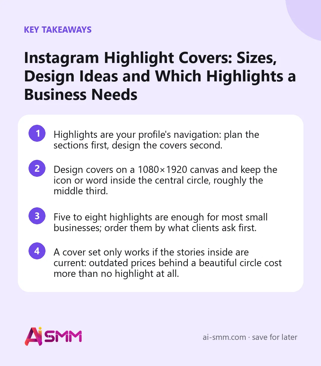
- Highlights are your profile’s navigation: plan the sections first, design the covers second.
- Design covers on a 1080×1920 canvas and keep the icon or word inside the central circle, roughly the middle third.
- Five to eight highlights are enough for most small businesses; order them by what clients ask first.
- A cover set only works if the stories inside are current: outdated prices behind a beautiful circle cost more than no highlight at all.
What highlights do for a business profile
Stories disappear after 24 hours; highlights keep the useful ones pinned under your bio for as long as you want. For a business, that makes them the closest thing Instagram has to website pages: a price list, a portfolio, answers to frequent questions, a route to your door.
In our experience, people who are about to buy tap highlights more than they scroll old posts. Someone choosing a salon wants to see results and prices in two taps, not to dig through a year of the feed. Well-named sections with recognisable covers shorten that path, and a shorter path means more messages and bookings.
Which highlights a small business needs
Start with the questions you answer most often in DMs. Each recurring question deserves its own highlight. Here is a starting set by niche:
| Niche | Core highlights | Optional |
|---|---|---|
| Beauty salon, nail or brow studio | Prices, Works, Reviews, Book, Masters | Aftercare, Certificates, Offers |
| Cafe, bakery, restaurant | Menu, Events, Delivery, Location | Breakfast, Team, Suppliers |
| Online shop | New, Sizes, Delivery, Reviews, Returns | Care, Gift wrap, Behind the scenes |
| Expert or consultant | About, Services, Cases, Reviews, FAQ | Free resources, Speaking |
| Fitness or yoga studio | Schedule, Coaches, Prices, First visit | Results, Challenges |
| Local service (repair, cleaning) | Services, Prices, Before/After, Area, Reviews | Team, Guarantee |
Order matters. The first three or four circles are visible without swiping, so put the sections that lead to a purchase there: usually prices, results and how to book. “About us” and “Team” can sit further right.
Instagram highlight covers: sizes and safe zones
A highlight cover is an image that Instagram shows as a small circle on your profile and as a full-screen image when someone opens the highlight. That is why the usual advice is to design on a regular story canvas and keep everything important in the centre.
- Canvas: 1080×1920 pixels (9:16), the same as a story.
- Safe zone: place the icon or word inside a central circle roughly 400–500 pixels in diameter. Everything outside may be cropped in the profile circle.
- Contrast: the circle is small on a phone, so a thin line icon on a pale background can disappear. Test it at real size.
- File: PNG or high-quality JPG; avoid tiny text inside the icon.
Instagram changes interface details from time to time, so after uploading the first cover, check how it looks on your profile before making the whole set.
Five design styles for highlight covers
1. Line icons on a solid colour
The most common style and for good reason: simple, readable, easy to extend. Pick one background colour from your brand palette and one icon style (all outlined or all filled). A calendar for “Book”, a tag for “Prices”, a heart or speech bubble for “Reviews”.
2. One word or initial
Instead of icons, a single short word (“Menu”, “Prices”) or a letter in your brand font. Works well for minimalist brands and for sections where no icon is obvious, such as “Cases” or “About”.
3. Photo covers from your own work
A close-up of a manicure for “Works”, a croissant for “Menu”, a product flat lay for “New”. Photo covers feel alive but become messy quickly unless you keep the same framing, background tone and filter across all of them.
4. Texture or gradient only
Soft gradients or textures in brand colours, with the section name doing the work. Calm and elegant, but make the names very clear because the covers themselves carry no meaning.
5. Mixed: icon plus brand pattern
A pattern or subtle texture in the background with a simple icon in the centre. Good for brands with a distinctive visual identity; keep the pattern low-contrast so the icon still reads at small size.
How to set highlight covers step by step
- Turn on the story archive in your Instagram settings if it is off. Highlights are built from archived stories.
- Create the highlight: on your profile tap “New” (the plus circle under the bio), choose the stories that belong to the section and name it.
- Set the cover: open the highlight, tap “Edit highlight”, then “Edit cover”, and choose your cover image from the gallery. You do not need to publish the cover as a story first.
- Adjust the crop: move and zoom the image so the icon sits in the centre of the circle.
- Reorder: the most recently updated highlight moves to the front. To bring a section forward, add a fresh story to it.
- Check on another phone or ask a friend to look at the profile to see what a visitor sees.
How to make a cover set without a designer
You do not need a designer or paid templates to get a tidy set. What you need is a few fixed decisions made once and then applied to every cover.
- Choose one background. A colour from your logo or brand palette, a soft neutral, or a photo texture. Use exactly the same one for every cover.
- Choose one foreground colour for icons or letters, with strong contrast against the background: white on a deep colour, dark on a light one.
- Choose one icon style. Outline or filled, thin or bold, but never mixed. If you use words, pick one font and one size.
- Make a master file at 1080×1920 with a circle guide in the centre. Duplicate it for each section and only change the icon.
- Export all covers at once, save them in a phone album called “Highlight covers”, and set them in one go.
- Keep the master file for when you add a section later, so the new cover matches the old ones.
A quick way to pick icons: write the section name, ask yourself what object a client would draw for it, and use that object. Prices is a tag or a coin, Delivery is a box or a van, Reviews is a speech bubble or a star, Location is a pin. Obvious beats original here.
When to redesign your highlight covers
- You have changed your logo or brand colours, and the covers no longer match the profile picture and posts.
- You have added sections one by one over the years, and the row now looks like three different styles.
- The business has changed direction: a cafe added delivery, a salon added a new service, an expert moved from consultations to courses.
- Visitors keep asking in DMs for information that is already in a highlight: the name or cover probably does not signal what is inside.
Naming highlights so people understand them
Names under the circles are short, and long ones get cut. Aim for one word or two short ones. Clear beats clever: “Prices” works, “Money talk” makes people guess. Emojis can replace or support a word, but not every visitor reads them the same way, so use them as accents rather than the whole name.
- Use the words your clients use in DMs: if they ask “how much”, “Prices” is better than “Rates”.
- Keep one language across all highlights.
- If you run one account for two cities or two services, add a short marker: “Prices SPB”, “Nails”, “Brows”.
What to put inside each highlight
A cover promises something; the stories inside have to deliver it. A practical structure for every section:
- First frame: what this section is and what the person will get (“Our prices for October”).
- Middle frames: the facts, one idea per frame: prices, examples, reviews, conditions.
- Last frame: the action with a link sticker or a clear instruction: “Book via the link in bio” or “Send us the word PRICE”.
Review highlights at least once a month. Remove stories with old prices, finished promotions and seasonal offers that no longer apply. Long highlights are not a problem if they are organised; highlights full of irrelevant frames are.
Common mistakes with highlight covers
- Designing covers before planning sections. You end up with a beautiful icon for “Lifestyle” and nothing for “Prices”.
- Too many sections. Fifteen circles means no one finds anything. Merge small sections.
- Different styles in one row. Two photo covers, three icons and a selfie look accidental.
- Icons too thin or too pale. Test at the real size on a phone, outdoors, in daylight.
- Old information inside. A cover set does not fix a price list from last year.
How to prepare covers and highlight stories in AI SMM
Highlights themselves are created and arranged in the Instagram app, but most of the work is making the images and keeping the stories inside fresh. In the AI content studio you can generate a set of cover images in your brand’s style from a short brief (“six minimal covers in sage green: prices, works, reviews, book, masters, aftercare”), and then create the story frames that go inside each section: a price list, a “how to book” frame, a delivery explainer.
Those stories can then be scheduled on the content calendar and published to Instagram automatically, after which you add them to the right highlight in the app. When the “Book” highlight points to your link-in-bio page or directly to online booking, a visitor goes from the circle to a confirmed slot without writing a single message. If you run a salon, our guide for beauty salons shows how highlights fit the rest of the profile.
FAQ
What size should Instagram highlight covers be?
Design them on a 1080×1920 canvas, the same as a story, and keep the icon or text inside a central circle about 400–500 pixels wide. Instagram crops the rest when it shows the cover as a small circle on your profile.
Can I add a highlight cover without posting it as a story?
Yes. Open the highlight, tap “Edit highlight”, then “Edit cover”, and choose an image from your gallery. It becomes the cover without appearing in your stories.
How many highlights should a business have?
For most small businesses five to eight is enough. Put the three or four that lead to a purchase first, since those are visible without swiping.
Why did my highlights change order?
Instagram moves the highlight you updated most recently to the front. To bring a section forward, add a new story to it; to keep the order stable, update sections in the sequence you want them to appear.
Plan your sections, design one consistent set of covers and fill each highlight with stories that answer a real question. When you need the images and the story frames quickly, the AI content studio in AI SMM will draft them in your brand’s style.
Posts, chats, video and sales in one workspace. 7 days free.
Start free