
 AI SMM team
AI image generators have made it possible to get a striking picture for any post in seconds. The problem is that striking is not the same as recognizable. A feed where every image comes from a different prompt, in a different style, with different colours and a different mood, looks like a stock library rather than a brand. The goal is not more AI images; it is AI images that look like they all came from you.
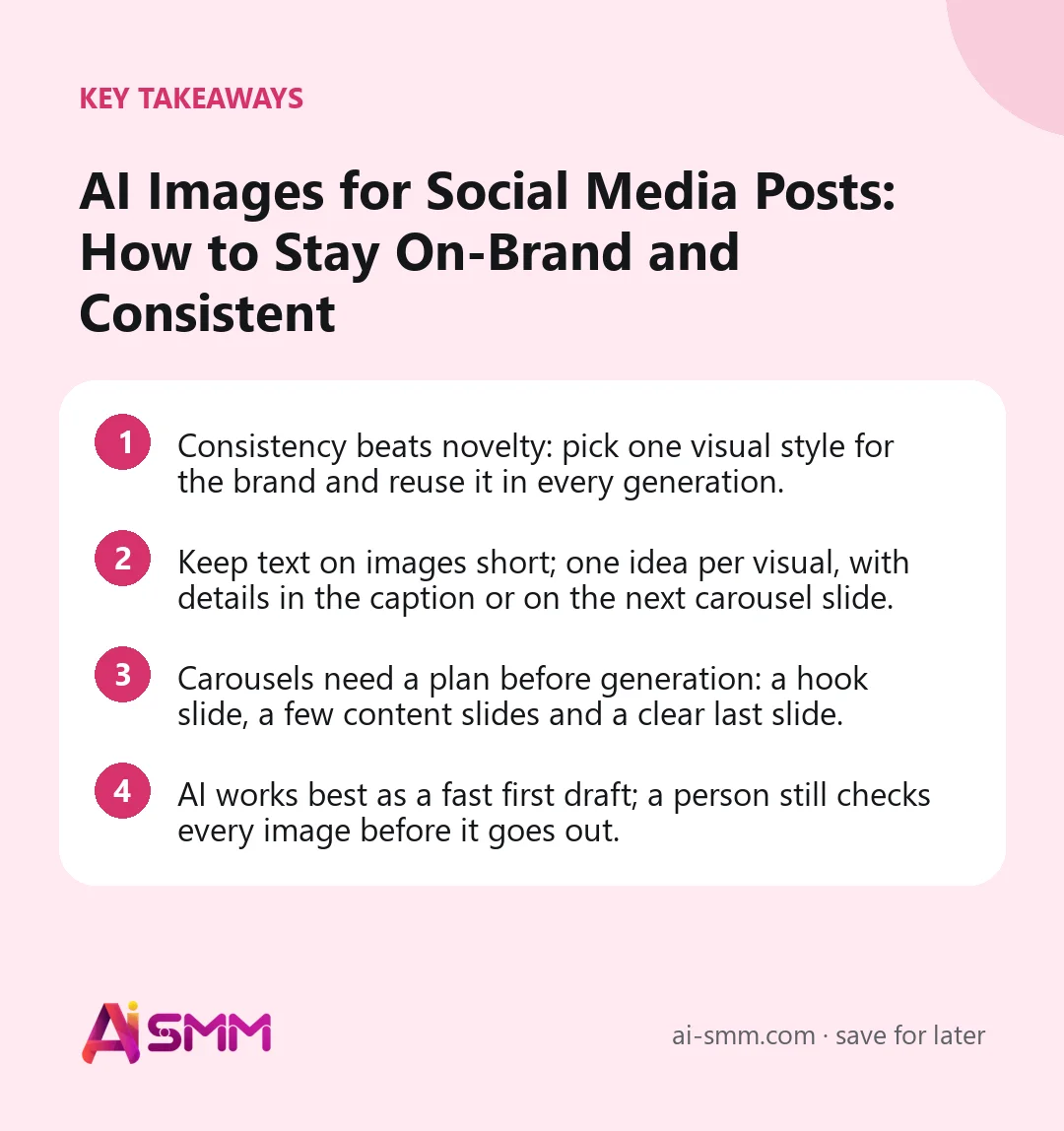
- Consistency beats novelty: pick one visual style for the brand and reuse it in every generation.
- Keep text on images short; one idea per visual, with details in the caption or on the next carousel slide.
- Carousels need a plan before generation: a hook slide, a few content slides and a clear last slide.
- AI works best as a fast first draft; a person still checks every image before it goes out.
Why AI images often look off-brand
Most off-brand AI images are not caused by bad tools; they are caused by missing decisions. When nobody has defined what the brand looks like, every prompt starts from scratch, and the model fills the gaps with its own defaults: glossy lighting, generic people, trendy gradients. Each image may be fine on its own, but together they tell no story.
Three things usually go wrong:
- Style drift. One week watercolour, the next week 3D render, the week after a photo. The feed stops reading as one brand.
- Too much text on the image. A headline, a subheading, a list, a price and a call to action all crammed into one square.
- Generic subjects. Smiling people at laptops and abstract shapes that could belong to any company in any industry.
All three are solved before you type the first prompt.
1. Define your brand’s visual style once
A visual style is a small set of choices that stay the same across posts. Write them down in a few lines:
- Mood: calm and airy, bold and energetic, warm and homely, clean and technical.
- Colour: one accent colour that is truly yours, plus one or two neutrals. Everything else is secondary.
- Medium: photography, flat illustration, paper collage, 3D. Pick one main medium and stick to it.
- Typography feel: a heavy display font, an elegant serif, a friendly rounded sans. Keep it consistent.
- Details that belong to you: a hand-drawn underline, a sticker shape, a textured background, a signature prop.
The style should follow the business, not a trend. Playful hand-drawn accents suit a craft workshop; the same approach can look unserious for a clinic or a financial advisor. Look at references for principles, such as one large subject, strong contrast, generous empty space, not for a look to copy.
2. Write prompts that carry the style every time
Once the style is defined, it should travel with every request automatically. A practical way is a prompt template with a fixed part and a variable part:
| Fixed part (same for every post) | Variable part (changes per post) |
|---|---|
| Medium, lighting, colour palette, mood, composition rules | Subject of the post, the main object, the setting |
| What to avoid: clutter, generic stock people, extra text | Season or occasion, if relevant |
For example, a bakery might keep “soft natural daylight, warm cream and terracotta palette, close-up, simple linen background, no text, no people” as the fixed part, and change only “a loaf of rye bread with seeds” or “a tray of cinnamon buns”. The results will differ, but they will look like siblings.
Write down the words to avoid too. If your brand is quiet and minimal, words like “vibrant”, “dramatic” or “futuristic” in a prompt will pull the result away from you.
3. Put less text on the visual
The most common mistake with social media visuals, AI-made or not, is using the image as a second caption. People scroll fast; an image has a second or two to stop them. In that time they can take in one idea, not five.
A simple rule: one meaning layer per visual. A strong headline of a few words and one hero object is usually enough. If you have a list of six tips, that is not one image; it is a carousel. If you find yourself adding a subheading, a list and a footnote, move them to the caption.
- Headlines: short and large, readable on a phone without zooming.
- Labels inside the scene: one or two words, not sentences.
- Empty space is part of the design, not a gap to fill.
- Do not repeat the same message in three places on one image.
There is a technical reason too. Image models still often distort letters. It is usually safer to generate the picture without text and add the words in a layout or editor, where the font and spelling are under your control.
4. Plan carousels before you generate them
Carousels are one of the best formats for saves and shares, because they let you tell a small story. They are also where inconsistency is most visible: ten slides in five different styles look broken.
A structure that works
- Hook slide: a bold promise or question in a few words, with a strong visual.
- Content slides: one point per slide, same layout, same colours, same position for headlines.
- Proof or example slide: a before-and-after, a result, a real product photo.
- Last slide: a clear next step, such as “save this”, “book in the link”, “write GUIDE in the comments”.
Generate the slides as a set with the same fixed style, and keep the layout grid identical. Only the content should change as people swipe. Also check where the carousel will go: Instagram, Threads and TikTok photo carousels support multi-image posts, while Facebook Pages publish photo or video without a carousel, so plan a single strong image for that network.
5. Keep the feed consistent over weeks, not just posts
Consistency is judged at the level of the grid, not the single post. Every couple of weeks, open your profile as a visitor would and look at the last twelve posts together:
- Do the colours feel related, or does one post shout in a different palette?
- Is there a rhythm of formats, such as photo, illustration with headline, carousel, rather than random switching?
- Would someone recognize your post in their feed without seeing the account name?
If the answer to the last question is no, tighten the fixed part of your prompt. Most consistency problems come from too much variation allowed in the style, not too little creativity.
6. Mix AI images with real photos
AI images are excellent for concepts, backgrounds, seasonal moods and illustrations of ideas. They are weaker at showing your actual product, your space and your people, and that is what builds trust. A healthy feed for a small business usually mixes both:
- Real photos for products, results, the team and the place.
- AI visuals for tips, announcements, quotes, seasonal campaigns and abstract topics.
Never present an AI image as a real result. A generated “after” picture for a beauty treatment or a generated dish that does not exist on your menu misleads customers and will backfire. Use AI to illustrate, and real photos to prove.
7. Adapt one idea to every network
The same idea rarely works in the same shape everywhere. A square image with a headline suits the Instagram feed, a vertical version fits Stories and Reels covers, and a cleaner image with the message moved into the text works better on Threads, where people come to read. Instead of generating a new picture for each network, generate one strong base image in your style and adapt it: crop, extend the background, move or drop the headline.
A small table in your notes helps the team remember what goes where:
| Where | What usually works |
|---|---|
| Feed post | One hero object, short headline or none, brand colour visible |
| Carousel | A set of slides with an identical grid and one point per slide |
| Stories and vertical covers | Vertical crop, headline away from the top and bottom edges |
| Text-first networks | A calm image that supports the text rather than repeating it |
Keeping one base image per idea also keeps the brand consistent across networks: a follower who sees you on two platforms recognizes the same visual rather than two unrelated pictures.
8. Build a small library you can reuse
Every approved image is an asset. Save the ones that worked well, together with the prompt that produced them, and sort them by purpose: backgrounds, seasonal scenes, product moods, illustrations for tips. Next time you need a visual for a similar post, start from what already fits your brand instead of from a blank prompt. Over a few months this library becomes the fastest way to produce on-brand content and a clear reference for anyone new on the team.
9. Check every image before publishing
AI speeds up production, but the final look still needs a human eye. A quick checklist before a post goes into the calendar:
- Does it match the brand style and colour?
- Is any text on the image spelled correctly and readable on a phone?
- Are there odd details: extra fingers, melted objects, impossible shadows, garbled logos?
- Does the image say one thing clearly, and does the caption support it?
- Is it appropriate for the network’s format and size?
Thirty seconds of review prevents the kind of mistake that ends up in someone else’s “AI fails” screenshot.
Creating on-brand AI images in AI SMM
In the AI content studio, the brand profile of the company, its tone, audience and words to avoid, is set once and added to every generation, and the visual style for posts is chosen once for the company as well, so images in one account stop drifting between looks. The studio generates images for posts, short AI videos and ready-made stories on models from OpenAI and Google Gemini; everything lands in Files and can go straight into the calendar for approval and publishing. Generations are paid with AI credits included in your plan, and the cost of each run is shown before you start.
The same studio writes the captions, can reshape one text into versions for different networks and runs an AI review of a post before it goes out. When you publish, the calendar knows each network’s limits: carousels for Instagram and Threads, photo carousels for TikTok, and photo or video without a carousel for Facebook Pages. For an agency, the brand profile is set per company, so each client’s look stays separate. Online sellers often use the studio to turn a phone photo of a new item into a finished post, and businesses that run chat flows reuse the same generated images in promo messages, so the brand looks the same in a post and in a chat.
FAQ
Can AI images replace a designer?
For everyday posts, announcements and tips, AI with a fixed brand style can cover much of the routine work. A designer is still valuable for defining the style in the first place, for the logo and brand system, and for campaigns that need a unique idea.
How do I keep the same style across many AI images?
Fix the style decisions, such as medium, palette, lighting and mood, and reuse them in every prompt, changing only the subject. Review your grid regularly and tighten the style when posts start to drift.
Should I put text on AI-generated images?
Keep it minimal: a short headline at most. Generate the picture without text and add words in a layout, where spelling and fonts are under your control. Longer information belongs in the caption or on extra carousel slides.
Is it okay to use AI images for product posts?
Use real photos to show the actual product and results. AI images work well as backgrounds, mood scenes and illustrations around the product, as long as they do not suggest something the customer will not receive.
A recognizable feed comes from a few fixed decisions, not from better luck with prompts. Set your brand style once and create visuals in the AI SMM content studio.
Posts, chats, video and sales in one workspace. 7 days free.
Start free