
 AI SMM team
The social media graphics design tips that matter most are simple: one message per graphic, a clear visual hierarchy, strong contrast, no more than two fonts, a small colour palette and text large enough to read on a phone at arm’s length. You do not need to be a designer to make posts that look professional; you need a few rules and templates that make those rules automatic. Below are 15 practical tips for small businesses, from layout and type to carousels, accessibility and a quick check before you publish.
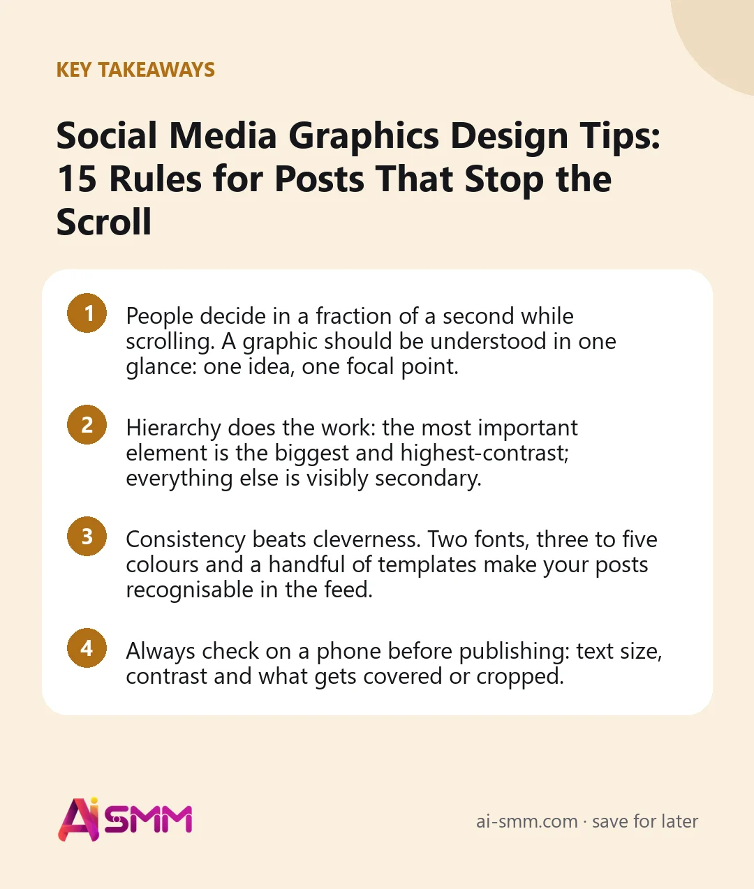
- People decide in a fraction of a second while scrolling. A graphic should be understood in one glance: one idea, one focal point.
- Hierarchy does the work: the most important element is the biggest and highest-contrast; everything else is visibly secondary.
- Consistency beats cleverness. Two fonts, three to five colours and a handful of templates make your posts recognisable in the feed.
- Always check on a phone before publishing: text size, contrast and what gets covered or cropped.
Why social media graphics design tips matter for a small business
On social networks your graphic competes with friends’ photos, memes and videos, on a small screen, for a moment. A good design does three jobs in that moment: it stops the thumb, tells the viewer what the post is about and signals that the business behind it is careful and trustworthy. The last one matters more than it seems: a cluttered, blurry or inconsistent feed makes a clinic, an accountant or a shop look less reliable, even if the service is excellent.
The good news is that most of what makes graphics work is rules, not talent. The tips below are grouped into layout, type, colour, images, formats and process.
Layout: one message, one focal point
1. One graphic, one message
Before opening any design tool, finish this sentence: “This graphic says ___.” If you need “and” twice, split it into a carousel or several posts. A promotion graphic says “20% off colouring this week”, not also your opening hours, three services and your phone number.
2. Build a clear hierarchy
Decide the reading order: what the eye should see first, second and third. Usually that is the headline or main image, then a supporting line, then a small detail like the logo or the date. Make each level visibly different in size, weight or colour. If everything is bold, nothing is.
| Level | Typical element | How to make it stand out |
|---|---|---|
| 1 | Headline, key number, main photo | Largest size, strongest contrast, most space around it |
| 2 | Supporting line, short explanation | About half the headline size, lighter weight |
| 3 | Logo, handle, date, small print | Small, muted colour, placed in a corner consistently |
3. Use white space on purpose
Empty space is not wasted space. Generous margins around the text make it easier to read and make the graphic look more premium. A useful habit: keep at least 5–8% of the width as a margin on every side, and never let text touch the edges.
4. Align everything to something
Pick a grid, even a simple one: text aligned left along one line, or centred on one axis. Random positions look amateurish. Left-aligned text is easier to read in blocks of more than two lines; centred text suits short headlines.
Type: readable at thumb size
5. Two fonts at most
One font for headlines and one for body text, or a single family in two weights. Choose fonts that are clear on screens; decorative scripts work only for one or two words, never for a sentence. Keep the same fonts on every post so your content is recognisable before anyone reads your name.
6. Make text bigger than feels necessary
Most people see your graphic on a phone, often as a thumbnail in the grid or in a preview. Designs made on a laptop screen almost always use text that is too small. As a rough guide for a 1080-pixel-wide graphic: headlines 70–120 px, supporting text at least 36–40 px. Test on a phone at arm’s length: if you squint, it is too small.
7. Keep text on the image short
A graphic is not a document. Aim for a headline of up to about 7–10 words and, at most, one supporting line. Put the explanation in the caption, or turn a longer message into a carousel where each slide has one short point.
Colour and contrast
8. Build a small palette and stick to it
Choose one or two main brand colours, one accent for highlights and buttons, and one or two neutrals (off-white, dark grey) for backgrounds and text. Three to five colours in total is plenty. Write their codes down in your social media style guide so everyone uses the same shades.
9. Check contrast, especially for text
Light grey text on white or yellow on light blue is hard to read for everyone and impossible for some people. The web accessibility guidelines (WCAG) recommend a contrast ratio of at least 4.5:1 for normal text and 3:1 for large text; free contrast checkers show the ratio in seconds. When text sits on a photo, add a solid block, a gradient or a darkened area behind it.
10. Use colour to guide attention, not decorate
Your accent colour should highlight the one thing you want noticed: the price, the key word, the button-like call to action. If the accent is everywhere, it stops working.
Images and brand elements
11. Prefer real photos of your business
Your real product, space, team and clients (with permission) build more trust than generic stock photos. Shoot in good daylight, keep backgrounds tidy and crop tightly on what matters. When you do use stock or AI-generated images, keep a consistent style, such as the same lighting, colour tone and framing, so they do not clash with your own photos; the guide to AI images for social media posts covers how to keep them on-brand.
12. Place the logo small and consistently
A logo does not need to be large to work; it needs to be in the same place every time. A small logo or handle in one corner is enough. Avoid putting it across the middle of a photo; it looks like a watermark and distracts from the message.
Formats and networks
13. Design for the format and the safe zones
Choose the canvas for where the graphic will appear, and keep important content away from the areas each network covers or crops.
| Format | Common canvas | Design note |
|---|---|---|
| Instagram feed post | 1080×1350 (4:5) | Takes more screen space than a square; the profile grid crops the edges, so keep text centred |
| Stories and Reels covers | 1080×1920 (9:16) | Leave the top and bottom areas free for the interface and caption |
| Carousel slides | 1080×1350 or 1080×1080 | Same size on every slide; consistent margins and headline position |
| LinkedIn and Facebook image | 1080×1350 or 1200×1200 | Portrait and square take more room in the feed than landscape |
| Pinterest pin | 1000×1500 (2:3) | Title text on the pin helps it get clicked and found |
| Link preview image | 1200×630 | Crop-safe centre; little or no text near the edges |
Sizes change from time to time, so check each network’s current guidance once or twice a year.
14. Design carousels as a sequence
A carousel is a mini-story. The first slide is the hook with a big headline and a hint to swipe; the middle slides carry one point each in the same layout; the last slide sums up and gives one action (save, comment, book). Keep the headline in the same place on every slide so reading feels effortless. For structures that work, see the carousel ideas with slide plans.
Process: templates and a final check
15. Make templates for your recurring posts
Most small businesses publish the same few types of post again and again: an offer, a tip, a review, a new product, an announcement, a before/after. Make one template for each with fixed fonts, colours, margins and logo position. Then each new post takes minutes, and your feed looks consistent even when different people make the graphics.
| Recurring post | Template elements |
|---|---|
| Offer or promotion | Big number or key word, product photo, accent-colour price, date in small text |
| Tip or how-to | Headline in the top third, 3–5 short points, same icon style |
| Customer review | Short quote in large type, first name and service, neutral background |
| New product or service | Clean photo, name, one benefit line, price if you show prices |
| Announcement | One headline, date and time, one action |
Before you publish: the one-minute check
- Can you say what the graphic means in one sentence?
- Is the first thing your eye lands on the most important thing?
- Is all text readable on a phone at arm’s length?
- Does text contrast clearly with its background?
- Are fonts and colours from your palette only?
- Is anything important near an edge that might be cropped or covered?
- Spelling, prices, dates and phone numbers correct?
- Alt text written where the network lets you add it?
Common design mistakes
- Too much text. If the graphic needs a paragraph, it should be a caption or a carousel.
- Too many fonts and colours. Each new one makes the design look less intentional.
- Text on busy photos without a background block or shadow.
- Stretched or pixelated images and logos. Always keep proportions and use large enough files.
- Every post in a different style. Followers stop recognising you in the feed.
- Designing only on a big screen. What looks balanced on a monitor often looks tiny and crowded on a phone.
Creating on-brand graphics in AI SMM
The AI content studio generates images for a specific post and uses your brand profile in every generation, so visuals and captions stay in one voice instead of looking like random stock. It includes templates in 34 categories for different kinds of businesses (announcements, promotions, before-and-after, educational posts and more), which gives each recurring post type a starting structure, and it can turn a product photo from your phone into a finished post with a caption.
Once graphics are ready, the calendar lets you publish them to Instagram as posts, carousels or Stories, to Pinterest as pins with a board and a link, and to LinkedIn, Facebook, Threads and other networks, checking each network’s format rules before the post is queued. Analytics then shows which designs got saves and shares, so your templates improve over time.
FAQ
Do I need a designer for social media graphics?
Not for everyday posts. With a small palette, two fonts and a few templates, a business owner or assistant can make clean graphics. A designer is worth it for the initial brand kit and templates, which everyone then reuses.
How much text should be on a social media image?
As little as possible: usually a headline of up to about 7–10 words and one supporting line. Longer messages belong in the caption or in a carousel.
What is the best font for social media graphics?
A clear sans-serif or a sturdy serif that stays readable at small sizes on screens. The best font is the one you use consistently; pair one for headlines with one for body text and stop there.
Should every post have the logo?
A small, consistent logo or handle helps when your graphics get shared or saved and seen out of context. It should never compete with the message.
Good design is a set of habits, not a talent. Pick your palette and fonts, make templates for your recurring posts and create the next one in the AI content studio.
Posts, chats, video and sales in one workspace. 7 days free.
Start free